| Temple Square is always beautiful in the springtime. Gardeners work to prepare the ground for General Conference. © 2012 Intellectual Reserve, Inc. All rights reserved. | 1 / 2 |
Based on the results and the feedback received during the testing, a new and simplified navigation menu on ChurchofJesusChrist.org recently launched in 10 languages.
The Church’s website used to offer over 98 links in the main navigation for people to sort through in order to find what they want. Feedback from website visitors has indicated that having so many options made the site confusing to navigate. Earlier this year, the Church took a significant step toward improving the study experience on ChurchofJesusChrist.org with the launch of the Gospel Library Online. (See related story).
With the new changes, instead of having study content such as scriptures, magazines, lesson manuals, and general conference spread out across the various navigation menus of the website, you can find all study-related content in the online Gospel Library—a single-access point similar to the Gospel Library mobile app. “This change allows you to stay in a focused environment that is optimized for a study experience,” said Lyman Kirkland, director of channels. “Due to the consolidation of study material on the website, we felt a simplified navigation was needed.”
In order to optimize the navigation to better meet visitors’ needs, over the past 18 months, the Church did extensive testing with millions of site users from around the world to determine how they navigate to the content they want, explained Kirkland. “We know change can be hard for many people,” he said, “but we wouldn’t make this change if the results of the testing hadn’t shown positive outcomes for site visitors.”

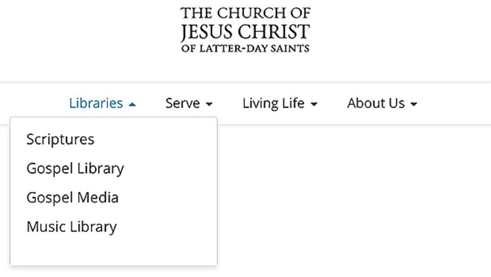
Navigation menus 2
A screenshot of the Libraries menu options. The new and simplified navigation menu on ChurchofJesusChrist.org will be launched in the coming weeks in 10 languages.2020 by Intellectual Reserve, Inc. All rights reserved.
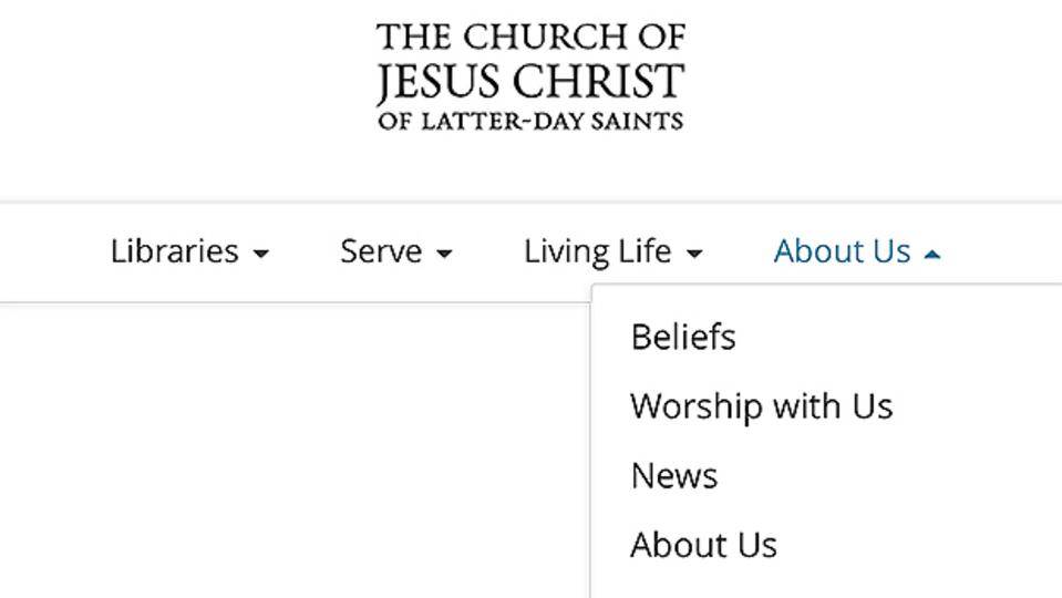
Navigation menus 2
A screenshot of the Serve menu options. The new and simplified navigation menu on ChurchofJesusChrist.org will be launched in the coming weeks in 10 languages.2020 by Intellectual Reserve, Inc. All rights reserved.The navigation changed from the current layout to a more simplified and focused layout (shown above). “We hope these changes will continue to help support those who visit the site,” said Kirkland.

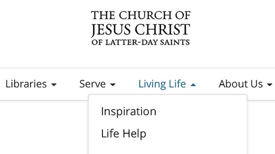
Navigation Menus 2
A screenshot of the Living Life menu options. The new and simplified navigation menu on ChurchofJesusChrist.org will be launched in the coming weeks in 10 languages.2020 by Intellectual Reserve, Inc. All rights reserved.